Lately I’ve been catching up on some contemporary titles, some of which are produced by my favorite writers in the field, and I’m actually finding plenty of things not to enjoy about them, which doesn’t make any sense. I’m sure that their concepts are nice and well-fleshed out enough to justify making a series out of them, and the talent on the book is reliable and proven. But that doesn’t mean that the books are fun to read.
So I started to wonder why, and several things started to pop out at me. I’ll be covering all of these topics in a number of subsequent essays, but let’s focus on the one that bugs me the most. Keep in mind, this isn’t intended to slam anybody’s work, it’s just my notes on things that detract from my personal reading experiences with these titles.
So yeah, first thing’s first. Caption boxes suck. I’m just going to come out and say it. I love comics. I love reading them. I love reading good writing within them. But Caption boxes are for the damn birds.
They are almost guaranteed to pull me out of a story and out of the page. It reminds me that I’m not on the same plane of existence as these characters. If I see a beautiful two-page spread and it’s littered with captions, I have to struggle to stay on those boxes.
For instance, over in ODY-C, the latest project from comic book rock star Matt Fraction, nearly everything is in a caption box, even the dialogue! I have the hardest time trying to push through these pages, I just keep giving up. I don’t know why, I’m not say it’s the comics’ fault or that the creators involved don’t know what they’re doing, I just think it’s hard as hell to keep my eye on these pages.
And that’s what comics is all about. Keeping your eye moving. When you map out a comic book page, you are using panel selection, composition and text to trick a person’s brain into thinking that time is moving forward within the context of what they’re looking at. And to trick their brain, you trick their eye. You keep it moving along the page and along the text and the reader soon forgets that she’s reading over a static image. You manipulate when and how the information is received so that it creates time, the same way dragging a needle over a groove creates sound.
When you put obstacles across the eye’s path, the illusion stops. One of those obstacles, a big one, at least for me, is this ugly little quadrilateral blemish, the caption box. It’s ugly. It’s rigid. I’m just going to say it, it looks ugly placed over art.
But there’s more to it than that. For me, the caption box has become synonymous with information, which means it’s become synonymous with exposition and info-dumps. That’s not what this dance is about. This is “show, don’t tell.” So my brain associates these little right-angled warts with being yanked out of the story and to be filled in on all the things the creative team didn’t know how to show in the panel. This isn’t necessarily cheating, but it’s not masterful storytelling, either.
Like voice-over narration in a film, it breaks the momentum of the story in order to bombard the viewer with information the writer or director thinks they need. In a comic, as in a film, things can be expressed subtly. You can have visual cues like facial expressions and body language and choices, as well as typographic cues, to indicate what’s going on in a character’s head. You don’t need a window into their mind. At least, I don’t think such a thing does anything other than remind the reader that they exist on a different plane from the character they’re watching.
Now, I know exceptions do exist. Writers like Neil Gaiman, Frank Miller and Alan Moore have proven that you can do some really good writing within the confines of those silly little boxes, and books like “Watchmen” use them strategically to overlap and juxtapose two different scenes, which is a pretty cool technique.
These guys and their peers are fantastic writers. They know how to write elegant and/or pulpy prose that sizzles and it’s fun to read. But not every writer can do that. Most writers can’t, I’d say. And that’s not even your job as a comic writer, in my opinion. It’s to tell a story with pictures, not to use pictures to accentuate words. There’s a subtle difference, but it’s there, and it’s what separates comic book writers from illustrated fiction writers.
Furthermore, writers need to just give the art room to breathe, goshdarnit! I can imagine that, as a writer, looking at a double-page spread with no written information on it might seem like you’re taking a shortcut, but for the reader it’s such a more pleasant experience. It gives me the time to let my eye wander and soak in every little line and brush stroke on the page.
These artists are already working hours on end to render the story that came from your head, like a poor, little, meat-made outboard printer. Don’t stand in the way of it when they’re done thinking you have to cloud the view with your attempts at being a novelist. Leave it alone. Let the eye move around the page, let me react to it, don’t explain to me what Thor or whoever is thinking, let me form my own analysis.
In conclusion, while some writers have found ways to use it to some degree of success, it seems to me that for the most part, the caption box does nothing positive for the comic book reading experience. It is an out-moded tool, and it must die. Writers need to become more confident in their visual storytelling abilities of themselves and their artists, and think of ways to keep the flow of a page moving above all else. None of the continuity or backstory or self-reflection in the world matters a bit if it means I have to be reminded that time is a trick that I’m letting myself fall for.
Up next… Thought Balloons!














That’s in interesting point of view, even if I disagree with a lot of what you’ve said. I think the traditional use of caption boxes, as exposition devices, is no longer viable and doesn’t serve to enhance the story. On the contrary, I would say that it hinders the story and breaks up the flow. When I read old comics, I often skip the caption boxes because I find they don’t add anything of value to the story and they break up the story into little chunks one panel long. I can’t get into the flow of the comic because it keeps being interrupted every time a panel like the first one above (the one with Professor Xavier) pops up.
However, I have nothing against caption boxes as a tool. I’ve read a large amount of comics where it works well. I think the larger issue with them is how often they’re poorly used. Placement, size, content, etc. are more often the source of frustration than the box itself. If we look at the comparison you used, voiceover narration in film, you can find similar examples of the technique being used poorly and the technique being used well. Blade Runner (the initial theatrical cut, I think – there are so many versions!) is a classic example of the technique being used very poorly. If you look at another example, Scorsese’s Goodfellas, the narration is the driving force of the movie. That’s what creates and controls the flow of the film. It blends with the movie’s visuals in a way that i’ve rarely seen.This is true of comics as well, I think. We’re so used to seeing the technique used in amateurish ways that we become ambivalent towards the device rather than the way it’s being used.
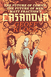
I think you’re being too cautious with your statement that you’re not trying to slam anybody’s work. I respect that you’ve included it here, but I think it plays against the argument you’re trying to make. “This comic is shitty, not because it was written by Matt Fraction, but because it has caption boxes!!” Fraction has written shitty comics. He’s also written excellent comics. I can’t recall off the top of my head if Casanova has caption boxes and how they’re used if they are indeed part of the comic, but it must have worked well because I consider it to be Fraction’s masterpiece. All of my favourite comic creators have written or drawn shitty comics, I wouldn’t always blame the technique itself, more how it was used.
I’m intrigued by the subject of your next article. How I feel about the look and usage of thought balloons is pretty similar to how you feel about caption boxes.
Bad writers are bad, that’s just a fact, any writer with a modicum of skill can write good narration captions. The problem largely lies with the fact that people try to imitate Claremont, Moore and Miller and have captions be the new thought bubbles.
I totally dig what you’re saying. I like comics a lot, but I don’t care for the whole ‘book’ part. The cool colors and computer effects, along with the awesome fonts in the sparse dialogue balloons really send me, man. Those dumb caption boxes, with all their poetic or pulpy scene setting screw up the ‘wide-screen’ movie feel of my Captain America digital download. Thought balloons with all those personal feelings and motivations, character building and all that crap just get in the way of my desire to swipe through the pages on my e-reader as fast as possible so I can consume the next easily digestible comic download in the least amount of time with the least amount of thought involved. That’s my jam!
My secret hope is that one of these days we can just do away with the whole ‘page’ thing that plagues modern comics and the pretty pictures will just move on their own and act out the story for us with sound and lots of cool special effects right on our tablets or phones. That way, we won’t even have to waste our time reading even one stupid word and we can enjoy comics the way they they were meant to be enjoyed.
You read my mind Mike.
I rarely read caption boxes at all these days. If I see a whole page littered with them I look at the pictures and move on.
It’s not about reading/ word count at all, I regularly read 500+ page books and devour them. It’s about flow, it’s about not fucking up the readers experience with your shitty
little attempts to describe what we can already see on the page in front of us.
Some writers use them well, but like less than 1%. If it’s a globe trotting adventure like Tintin, then yes a page turn may mean we in a whole different country, so it is nice to know, that requires one word.
Not a miniature novella crammed into type so small my eyes bleed squinting at the ugly
little box in the corner while some action happens elsewhere on the page.
Another place it sometimes works is with Batman’s internal monologue – when it used as
the only words on the page, meaning several pages of no speech. Again, few writers get
it right, most just ape what others do, or put captions in out of tradition, which to me is the laziest form of writing.
You’re right that poorly written caption boxes really slow down a story and add nothing. However, I don’t think we should damn the entire practice. I’ve always focused on the writing in comics, and I frankly find most contemporary books to be underwritten. It shouldn’t take me as little as 10 minutes to get through a book. Caption boxes can help add depth and layers to a story in a distinct way. Also, just like many writers don’t use them well, many artists cannot just tell a coherent visual story. Focusing on ineffective art will be no cure for poorly written caption prose.
|\__/| I’ll agree to disagree. |\__/|
I mean there is examples of great captions, dialogue that is very wordy (anything by allan moore really) and then there are comics with minimal dialogue that flow perfectly in the sense that they do exactly what the author intends such as Invincible and Savage Dragon, they play out like films or television.
Yeah if I finish a book in ten minutes that I just paid five bucks for I feel a little cheated.
Which is why a few years back after over 15 years of monthlies I switched to only ever buying TPBs and graphic novels, also bought more independent, Euro and Japanese comics with stories that have a beginning, middle and end and generally are better priced for their page count and production quality.
However, the intrinsic worth of a story in the comics/sequential art medium should not be dependent on how long with takes to read it nor be tied to the commercial value of the overall production.
The value and integrity of a story to me comes with the writers intention, and should not in my view have words count arbitrarily added to nor subtracted from to make a book take a different amount of time to read, or to be perceived as of a different monetary value.
Let’s take Tintin for example, loads of dialogue, loads of caption, and it works. The story flows smoothly.
Now let’s take say Savage Dragon or Invincible – two books I have read from the beginning up to the modern day. The dialogue is minimal and also here flows. Both books have writers who intentionally minimise the use of or do away with captions for the reasons you stated in your article.
I have zero interest in reading say a single issue of Invincible, I only read it when they release the over size hardcover trades. It is like getting a full season of a TV show to binge on.
The book works so well in that format, and american comics have slowly bu surely managed to improve the quality of their long form narrative, but still pale in comparison to their European and Japanese cousins – who have been doing it for decades, with more authorial control and little to no gimmicks. Just good writing and good stories.
In a way superhero comics have held back the telling of good stories in North American comics. If they subscribed to the novel or graphic novel format rather than the monthly toilet paper rag format they would have far more respect by now, and no doubt be of better overall quality for not pandering to sexism, fanboyism and endless monthly gimmicks, crossovers, universe ending “events” that mean nothing and stupid gimmick variant covers, the stupidest of which being a blank white cover (I’m looking in your direction Marvel!)
So yeah, rant over. What matters most in comics is that the story flows and the dialogue/caption/thought baloon/onomatopeia not interfere with the telling of the story any more than you want someone with a big Marge Simpson size head sitting in front of you in he cinema when you watch Star Wars.
Comics (as least superhero comics) are about pacing and movement, rhythm and flow. You lose the flow, you lose the story, you lose understanding and comprehension, you lose immersion, then you lose the reader.
Anyhow, I do ramble on but I did really enjoy your thought provoking article, so thanks again for writing it.