Introduced yesterday.
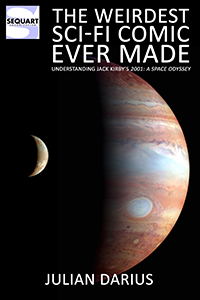
Before Jack Kirby continued the story of 2001, he adapted the film into a 70-page comic. Although the comic adapts the film — it uses Jupiter, for example, whereas the novel used Saturn — it does incorporate some dialogue from the novel. Strangely, it also incorporates elements from the screenplay, in which the computer HAL spoke more colloquially. Such inconsistencies with the finished film are common in adaptations produced in time for the motion picture release, but they’re rarer in adaptations produced long after the fact, as this one was.
The adaptation is divided into four chapters. The first follows Moonwatcher, the main ape who encounters the alien Monolith in the beginning of 2001, thus kickstarting human evolution. Of course, this entire sequence lacks dialogue in the film — there’s no human to speak, after all, and music famously fills in the gap. In Kirby’s comic, however, every single panel has a caption, describing what’s happening, what Moonwatcher thinks and feels, and telling us the significance of what we’re witnessing. At times this works — as when Kirby tells us that Moonwatcher doesn’t know the ape he’s found dead is his own father, since he doesn’t understand reproduction. At other times, the captions feel like they’re spelling things out far too much, or even preempting us from observing and thinking — a process the sequence in the film triggers rather effectively.
More startling is Kirby’s depiction of the Monolith. An all-black space on the page would be hard to pull off, and Kirby can’t resist depicting it more dramatically. He even includes his famous “Kirby krackle” — those overlapping dots that are supposed to look like energy, brimming over or escaping out of some device. The result looks more like something out of Kirby’s Fantastic Four than the Kubrick film.
In the film, this initial sequence ends with a dramatic cut to 2001, as the image of a bone tossed into the air gives way to the image of a spaceship moving through space. It’s a surprising juxtaposition, and not only because it jumps forward millions of years. It also implies a connection between the bone, as a primitive tool, and the eventual development of space travel. It’s the natural evolution of our ability to use tools, spurred by the Monolith — or so the film seems to be communicating through this visual shorthand.
To his credit, Kirby seeks to adapt this powerful transition. But he does so in panels of different sizes, so that the bone almost seems to morph into the spaceship. It feels too literal, yet it fails to recognize that a more literal translation into comics — using (likely silent) panels of the same size, simply positioning the bone in the same position as the spacecraft in the following panel — would be more successful. Kirby’s not so much adapting the famous cinematic cut into the comics form as adapting them into the super-hero comics form.
Kirby’s captions also manage to miss the point of the cut. Instead of describing humanity’s use of tools, he focuses on underlining his adaptation of the transition by describing the bone’s trajectory in ways reminiscent of a spaceship. In the page’s third and final panel, he places emphasis on the amazing shift from the distant past to the year 2001, which is the most superficial aspect of the transition — ignoring any of the sequence’s philosophical implications, involving tools or evolution, that one might expect these captions to play with, if not actually tease out.
As with the Monolith, Kirby can’t resist depicting outer space in his typical, flamboyant way. Instead of the mostly black void seen in the film, we now have a black and pink field that’s positively filled with excitement — a purple atmosphere, two explosions (one of purple, the other orange), light blue orbs inexplicably floating copiously, and Kirby krackle everywhere.
None of this makes any sense, of course, but it’s oh so dramatic. It also completely removes the realism and majestic minimalism of the original film.
As the adaptation begins its second chapter (melodramatically and not-so-inventively titled “The Thing on the Moon!”), Kirby uses the adaptation’s first of many photo-collage panels. Kirby helped popularize this technique in comics in the 1970s (especially on DC’s New Gods), and there’s no denying that it fits well with outer-space material — especially an adaptation of realistic sci-fi like 2001. Unfortunately, when juxtaposed to the previous page, it also underlines how cartoony Kirby’s own depiction of space is. As Kirby uses this technique throughout the adaptation, it consistently produces this effect, but it’s particularly pronounced here, in its first instance, coming immediately after the story’s rather absurd first depiction of outer space.
To his credit, Kirby takes the time to adapt elements that depict space flight realistically, yet serve no other real purpose. Characters and instruments defy gravity, accompanied by Kirby’s captions that spell out how this is done — which might be foreign to the movie but not to the novel. It’s the kind of thing you rarely see in sci-fi comics, where outer-space settings are usually exotic backdrops, in which characters stand and act exactly as they would on Earth — which surely represents a failure of the creative imagination, given that these conventions in TV and film are primarily due to budget considerations that comics don’t have.
Also to his credit, Kirby adapts the long journey to the Monolith on the moon, which doesn’t feature much conflict and isn’t exactly Kirby’s metier. Here, Kirby faces a challenge: to render some rather talky and expository material into the visual comics form. Of course, cinema is also visual, but it’s limited in that it doesn’t change its aspect ratio, so almost all shots are of the same size — barring the rare use of the split-screen technique or cropping an image so that it’s not the full screen size. Comics, of course, are constrained by the size of the page in a similar way, but most comics don’t feature a single panel per page. Instead, comics break that space into static panels, and the size and placement of each panel can reflect the contents of the panel. In this way, the shape of the image can be used to control the pace, to emphasize, and to give room to visuals deserving of this attention — whereas cinema tends to give the same space to someone talking as it does a magnificent vista. Kirby, a natural at manipulating these elements of the comics form, uses these advantages over the material’s source medium.
For example, when the Monolith is revealed — but not shown — during a presentation, Kirby uses a large panel to show the audience’s various shocked reactions. He can’t resist heightening the melodrama, with a caption and various word balloons, whereas a more understated large panel would probably work better — although this would have gone against the grain of the way comics were produced at the time, especially in Kirby’s more mainstream circles. Nonetheless, he knows to follow the smaller panels filled with exposition with this larger one, and it’s the size of the panel that emphasizes the melodrama, more than Kirby’s dialogue or captions.
An even better example occurs when the protagonists are en route to the Monolith on the Moon. The comics page, like the cinema screen, seems invariable in size, even if one breaks it up with multiple panels or split-screen techniques. But of course, the comics page isn’t invariable in size. Comics can double that size at will by simply continuing art from one page to the next. Comics have even inserted fold-out pages to get even more size. Today, online comes aren’t limited to any consistent “page” size at all. For cinema to do such a thing, it would have to expand the size of the movie or TV screen. Kirby exploits this strength of the comics medium, relative to film, by employing a double-page spread, adding visual drama to a sequence that’s lacking in action. Of course, this looks even better in the large, tabloid-size format, in which this adaptation was published.
When the characters visit the excavation pit, in which the Monolith stands, Kirby mirrors the film quite closely, the largest difference being the way he depicts outer space as an area of wild activity, rather than a deadly black field. As a result, the image looks less stark and indisputably less realistic — but here, Kirby’s expressive outer space horizon makes the image, and thus the Monolith, seem even more alien, even more bizarre.
Kirby’s depiction of the black Monolith itself, like the blackness of space, shares the same wild expressionism. Like Kirby’s ancient Monolith at the beginning of the story, the Monolith on the Moon is brimming with energy. In the film, it’s a black void like space itself — cool, dispassionate, featureless, and more frightening for it. Perhaps this wouldn’t translate well into comics, but it feels like Kirby can’t resist transforming the Monolith into a piece of alien technology that emits wild swirls of energy — not unlike the super-hero technology he spent much of his career drawing, or the way Kirby finds outer space more interesting when it looks more like a Pop Art version of an expressionist painting than anything human or recognizable. The result is a Monolith that’s more certainly more exciting than the film’s but in a pulpy way that bears almost no relationship to the film’s austere cerebralism.
As Kirby shifts to the story’s third chapter, he tries to echo the film’s moving images — much as he did in the transition from the first to the second chapter. Here, he uses four page-wide panels of the same size to depict the movement of the Discovery One through space, on its way to Jupiter — echoing the long shots of the same in Kubrick’s film. It’s a good idea, and Kirby’s wise to use panels of the same size, echoing the static size of the cinema screen — which he failed to do in the earlier chapter transition. But Kirby can’t resist adding captions, which use many words without either propelling the plot forward or poetically teasing out implications of what we’re seeing. And here, Kirby’s expressionistic depiction of space radically undermines what he’s depicting. He’s adapted a scene that’s about the tedium and isolation of what real-life space travel might be like, but he’s set this sequence not in space at all but in some bizarre otherworldly dimension.
This isn’t outer space. It’s more like the Negative Zone of Kirby’s Fantastic Four. It’s certainly not our solar system, nor any space we might recognize.
Chapter three (which Kirby titles “Ahead Lie the Planets”) contains the material that’s probably the most frequently referenced portion of the film: the conflict with HAL, on board the Discovery One.
Here again, Kirby echoes the film’s visuals closely. When these visuals are on board the ship, they don’t suffer from the problems inherent with Kirby’s depiction of space, nor his energetic depictions of fantastic technology like the Monolith.
One of the most successful pages in the entire adaptation is of the centrifugal room from the film, in which Frank Poole goes jogging. Here, Kirby takes full advantage of the fact that the comics “screen” is of variable dimensions, employing panels as tall as the page to emphasize the verticality of the image, in which there’s no up or down.
That’s something Kubrick couldn’t do in 2001, with a screen inflexibly wider than it is tall. Indeed, watching the film, it’s easy to wish the dimensions of the film were more vertical, and Kubrick has to wrestle against the medium of cinema itself in these scenes.
Playing with the shapes of panels might seem obvious, but Kirby employs this strength of the comics medium brilliantly — especially given the added height of the tabloid format. Here, at least, Kirby’s arguably improved upon the original — and used the strengths of the comics medium to do so.
On the other hand, Kirby fails rather completely in adapting the famous scene in which HAL reads the astronauts’ lips, foiling their attempt to avoid HAL from overhearing. In the film, Kubrick gets the viewer to understand what’s happening by focusing on the HAL console, then depicting the astronauts from his perspective and closing in on their talking — but silent — lips. In this, the film is communicating what’s happening through a series of juxtaposed images, first causing us to understand that we’re seeing things from HAL’s perspective and then causing us to focus on the astronaut’s lips.
It’s fully possible to reproduce all of this in comics, although it would take several panels to do so, since the effect requires the juxtaposition of multiple images. To make sure the effect was communicated, several panels could zoom in on the astronaut’s lips. And given Kirby’s predilection for captions, any ambiguity in the sequence could be spelled out so as to make what’s happening perfectly clear for readers.
Instead, Kirby just handles all of this in a single panel. He simply uses a caption to tell us that HAL’s reading lips. The panel’s image is itself quite close to the original, but the effect couldn’t be different.
It’s certainly… an economical solution. But it’s not very successful, subtle, or imaginative. It uses one of the strengths of comics — the written word — as a way of avoiding solving a problem in adapting visual narrative. Instead of using writing as a separate “track,” not unlike sound in film, capable of accenting or undercutting the visual “track,” Kirby’s used it here to avoid coming up with a visual solution, or taking the space necessary to do so.
If Kirby’s depiction of the centrifugal chamber represents some of the best of comics, this panel represents some of the worst.
Of course, it’s not like Kirby was alone in using captions to “fix” visual problems and narrative ambiguities. Stan Lee did so all the time. Silver Age Marvel comics are filled with this kind of incredibly poor storytelling (such as characters tossing something not previously shown, with only a caption explaining how they got it, or even why they’re doing what they’re doing). In Kirby’s defense, he’s only repeating the bad habits he learned from a long career in corporate comics.
Tomorrow: the conclusion!


