What’s the difference between a comic book and a novel? The answer seems pretty obvious, doesn’t it? Yet, it still confounds me to no end that someone will take the time to write a review about a comic book or graphic novel and utterly fail to address the artwork. Sadly, it happens all too often. I was looking at some reviews recently, and sure enough, I found no less than three reviewers over the course of a single week who failed to address the art in any substantive way with one of those writers ignoring the artistic team altogether. If we’re talking about a prose novel, then sure, no need to address the images included on the cover or the chapter divider pages. But an artistically driven medium like comics? Negligent.
I’m sure there are a number of reasons for why this happens, but I suspect many of these offenders suffer from a lack of vocabulary when it comes to talking about the technical aspects of a comic. How does one differentiate between the penciller and the inker? What does the colorist bring to the table? In what ways do letterers affect the reading experience? All seemingly complicated stuff … but not really. The good news is this is a very easily remedied problem. The solution: Do your homework and start reading.
Published Resources
Where does one begin? Below are a few sources I’ve used to increase my understanding behind the process that goes into making comics and the different ways the medium functions. These sources have helped — I’d like to think — to improve the level of critical analysis that I bring to my comic reviews. It’s certainly not comprehensive, but it does provide some key sources worth reading:
- Scott McCloud’s Understanding Comics. Required reading that provides a formalist breakdown of comics and comics theory. I also have two of his other books – Reinventing Comics and Making Comics. These aren’t operating at the same level as Understanding Comics, but I’ve found them useful and informative all the same.
- Jessica Abel and Matt Madden’s Drawing Words and Pictures and Mastering Comics. These two books are essentially two independent self-studies on making comics and incredibly accessible.
- Will Eisner’s Instructional Book Series. Just buy them all. Seriously. This is one of the industry’s greatest legends, and these books formed the basis for the classes he taught in New York on comics studies. If you can only get one, go with Graphic Storytelling and Visual Narrative.
- The Internet. There are a lot of good articles posted online about how to review comics. David Harper (Multiversity) has a really nice article on the subject, which includes some suggestions from industry pros as well. You can find it here. And as a shameless plug, I’ve written about the subject on Sequart as well – available here.
- Comic Conventions. Go talk to artists. Ask them what sort of feedback has been the most beneficial and informative to them. As a comics critic, I’m not trained in the fine arts, so I am not able to provide that level of feedback in my reviews. That said, I’ve learned a lot about what to look for artistically by chatting about the form with artists at various conventions.
- Make Your Own Comics. In all honesty, you’ll learn an awful lot and gain a fuller appreciation for what these artists and writers are doing by attempting to create your own comic story. It doesn’t have to be long either — just seeing what it’s like being the writer, being the penciller, the inker, the colorist, the letterer. And when you’re done, go look at one of the comics you purchased off the newsstand and reverse-engineer that issue. Not only will you have a greater appreciation for the process, but you’ll have a little more understanding of how the parts of the comic work (and don’t work when done poorly from having done so firsthand).
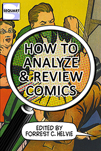
There are also a number of more recent books out there from well-known creators and editors such as Brian Michael Bendis (available this in July), Fred Van Lente and Greg Pak (due in the fall), as well as Jason Brubaker, Andy Schmidt, and others. Each of these books covers much of the same ground, but they do so from a variety of perspectives from within the industry. Pick one, check it out, and apply what you’ve learned. I tell my first-year writing students that knowledge application can be stressful, as they’ll make mistakes at first; however, they’ll discover they’re improving as they commit to practicing on a regular basis.
What’s more is many creators do read our reviews, and I’d like to think (foolishly / naively) they’re listening carefully to what we have to say. So before you hit “Post” or “Send” and air your review for the world, try to make sure you’re not leaving out the people who are responsible for the defining characteristic of this medium: The artists and their art. Be brave and take a risk by talking about those parts of the comic that are intimidating. Keep doing it until you get better.
Instead of simply talking about it, however, I’d like to walk through some examples of some basic comic art analysis from a non-artist’s perspective. It should be painfully clear that in no way is what I am providing anything close to comprehensive. Instead, I’m only looking to “start a conversation” with this framework and provide some basic examples of talking about comic art.
However, it’s important to hear from the pros as well, and I was fortunate to have a few individuals share some thoughts on those specific areas of comic art. It’s one thing to hear from someone whose writing career has been largely academic in nature; it’s something different to hear from those in the trenches. Finally, because this article is aimed primarily to those comic fans who either currently are writing about comics or those who desire to in some capacity and have others read those reviews, I’ll end this series of articles with a brief question-and-answer session with the editorial team from one of the comic industry’s leading news sites.
So let’s dive in, shall we?
Continued tomorrow…





awesome, great advice!
I’ve read McCloud’s book, but I’ll have to look for the others. i’ve especially been meaning to check out Eisner’s
Couldn’t agree more with trying it yourself. I just recently tried one and discovered just how difficult the letterer’s job is! the fonts, the spacing within the balloon, finding a place to stick the balloon, where to italicize/bold–not to mention when you want to get crazy with the letters… all these things i’d never even noticed before!
you can find what i came up with at http://themightythor66.tumblr.com/
Pro tips gratefully acknowledged.